(Above: Self portrait courtesy of Tekla Severin)
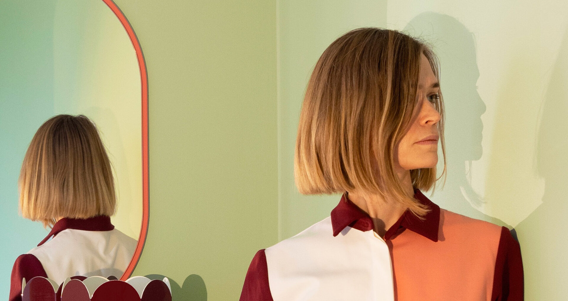
Tekla Evelina Severin takes joy very seriously. The Swedish-born designer and colorist is known for her color-drenched, graphic photography; interior and set designs with perfectly paired color combos; and collaborations with furniture, textile, and fashion brands like Montana Furniture, Heymat, NCS Natural Colour System, Air France, and more. Her products provide people a sense of joy in their own lives and work — whether they are specifying, choosing out pieces for their own home, or looking for inspiration on the perfect color story.
She’s had a lifelong love affair with color, discovering its power as a child growing up in Sweden with the long, dark Scandinavian winters. She remembers vividly her fondness for the wall-to-wall powder pink carpet in her childhood home — and how the energy of the room changed when it was replaced with grey flooring. While a more durable choice for a family with a small child, the loss gave her an early sense of the power that color and texture can hold in an interior space.

Courtesy of Tekla Severin
She also credits her poor eyesight at a young age — and the neutrality of modern Scandinavian design — for her colorful sensibilities. As a young designer, she felt “something was missing, the creativity was missing somehow,” she says, reflecting on the beiges and greiges that were popular at the time. “It was the conformity that bothered and bored me.” The combination of the long dark winters, the struggles of bad eyesight, and the hyper-neutral modern palette gave Severin an appreciation for how lucky we are to experience light, color, and textures — “It just feels so precious,” she says, so why not dive in?
“Remember, color is the most impactful tool there is — it’s the first thing that the human eye registers before shape, size, or function.” We know that we experience color biologically, emotionally, and culturally — that it can evoke different feelings and senses. “Think of color and space like a canvas and paint,” continues Severin, “As a wholeness, you’re creating an atmosphere.”

Photo by Yellows and Mikkel Mortensen

Kirkby Design
Harnessing Color, Generating Joy
The textures and layers of Severin’s design and photography work are meticulous and balanced, nearly surreal in their graphic nature. Her studied eye provides patterns and color fields that have a playful, cheerful nature, and give the impression that every little detail has been well thought out and considered — and you wouldn’t be wrong.
There are numerous color theories, rules, and systems with which to build foundational knowledge, like the color wheel (i.e. complementary, analog, and monochromatic colors); the 70/20/10 rule for balanced color schemes (dominant, secondary, and accent colors); and the NCS – Natural Colour System, which defines and communicates colors through how humans perceive them and their relationships to each other — all great tools to have in a designer’s toolbox. Still, ”you should find your own rules and create your own atmospheres,” she explains, because exploring color in your work is “more about examining yourself and your space.”
Some of Severin’s favorite rules? “One of my favorite ways of combining colors — which might sound a bit weird — is to combine ‘something flirty and something dirty,’” she says. “So something bright, or pale, or bubbly, with something more grounded and deep. For example, combining an airy sky blue with a deep grounded burgundy.” That pairing, sky blue and burgundy, is her current favorite color combination. “Otherwise, I love tone-on-tones of warmth like pink/peach/red/burgundy, and yellows ranging from deep mustard to butter yellow.”
Or, if you’re looking to create a bolder yet refined statement, don’t always reach for that pop of color — instead, Severin recommends experimenting a bit more: “I would suggest analog color schemes. They feel harmonious, calm, and rich at the same time.” How does she know she’s found a strong color composition? “It’s always about finding balance. It’s hard to put into words the sensuous feeling when certain colors sing together,” she says. “Color is always relative, never absolute. It’s what you put next to it that defines it.”

Photo by Beppe Brancato
Carving a Colorful Path
Fresh out of design school, Severin found herself working at an architecture studio in Stockholm; she relished exploring the material and color library, although she felt stuck in a neutral-palette purgatory of greiges and beiges. She spent her free time creating mood boards and still lifes, creating “visual notes” and photographing them. This set her on the path to creating her own visual language — a geometric, graphic world full of color blocking, saturated surfaces, and compositionally balanced work.
She was learning a lot about the day-to-day of design work — running projects, managing clients, construction drawings, and specifications — but exploring what gave her joy on her own. “I thought it was really liberating,” she says, not having to care about “function or construction” but focusing on her own interests, like “strong visual elements, setting the scene, angles, shadowplay, and color combinations of course.” And thus began her multimedia exploration of color.

Courtesy of Tekla Severin
She started her own studio in 2015, where she worked as an architectural photographer; art director, set designer, and photographer for a Canadian shoe company; and did work for clients like Adobe and Apple. More recently, she was the artistic director behind paint and furnishings company Toniton, and she collaborated with Montana Furniture. “With this I felt I could come back in a new way to interior design, and to be as free, deconstructed, and abstract as I wanted,” she says of her more recent endeavors.
“It’s really an amazing moment to create something new,” says Severin, “during the creative flow — usually in the second phase of starting a new project, when you really see the vision. This is joy for me.” To help achieve a flow state, she gives herself space in her daily routine. “Taking a walk during the day, having a coffee, staring into space — all help me to focus my mind,” she explains. “The creative brain works 24/7 and balance is hard but important.”
Related Articles
-

Design Leaders: Taewoo Kim of Wilsonart
“Innovation is not created by design alone — it happens when design and technical expertise come together," says Taewoo Kim -

Design Leaders: Dax Pettibone of 3form
"Great design doesn’t happen by accident; it is the result of deliberate decisions made at every level," says Pettibone -

Urquiola, Jongerius, Devlin: 3 Can’t-Miss Exhibits
These living legends are giants in the industry — and each has exhibits open this year honoring their careers -
5 Iconic Spaces from India Mahdavi
From a much-Instagrammed restaurant in London to an alpine retreat in the French Alps, India Mahdavi’s interiors transform space into story -

How to Design — and Live — Joyfully
Milan-based designer Serena Confalonieri reflects on how she brings joy, vibrancy, and energy to her professional and personal life -

Joy, Unfiltered with Serena Confalonieri
From glass beads to punk rock, the designer dishes on what brings her delight