District 1 is often called the Wall Street of Hồ Chí Minh City, Vietnam. But while it’s flush with sky-high office towers and buttoned-up banker types, there’s more to the neighborhood than meets the eye. Tucked in the folds of its contemporary, commercial façade are meandering back alleys, hidden markets, and historic relics of the city’s French colonial past. One of those spaces now belongs to Zorba, a film production company whose new headquarters occupies the upper floor of a two-story shophouse on Nguyễn Công Trứ Street, one of District 1’s oldest and busiest arteries.
Local architecture and design firm sgnhA transformed the 1,614-square-foot (150-square-meter) space into a conceptual bridge between Zorba’s building, and its brand—and the team did in all in just four months.
sgnhA co-founders and principal designers Nguyen Tran and Anh Nguyễn approached the space like archaeologists digging for artifacts. sgnhA’s goal for the space was to fuse newness and nostalgia. “We tried to create a space that feels familiar to local people—especially young people,” says Tran.
Before
When sgnhA found the shophouse for Zorba, it was dark and dirty, says Tran.
After
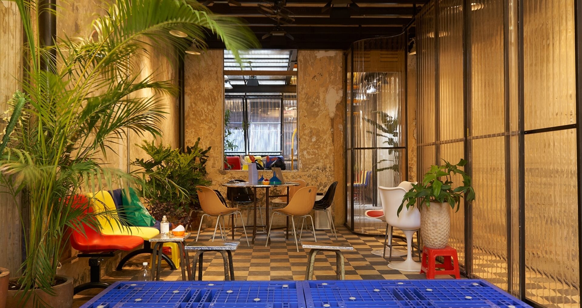
sgnhA installed sliding translucent polycarbonate panels that divide the space into distinct areas for different uses. “The client’s field is cinematography, so we wanted to create the concept of ‘scene,’” Tran says. “We use polycarbonate wave sheets to create a filter. We love the effect of looking at things through this layer.”

Before
A look up revealed the building’s biggest warts: A leaking steel roof that radiated uncomfortable heat, and a ceiling made of damaged cement and wire mesh.
After
To maximize comfort, sgnhA replaced a portion of the roof above Zorba’s workstations with heat-proof steel. It also removed the damaged ceiling to expose the underlying roof structure and repurposed its handmade wire mesh in wall lamps and floor tiles. A portion of the roof was left open—a natural skylight above an internal courtyard—to enhance views and support natural ventilation.

Before
Leaky roof notwithstanding, one of the things Tran liked best about the shophouse was its high ceilings, which created a naturally open, spacious feeling and allowed for vertical expansion within an otherwise compact footprint.
After
To maximize the space without disturbing its historical envelope, sgnhA installed a steel structure that acts like a modular skeleton inside its antique skin. The structure exploits the building’s generous vertical space by creating two floors within a single story. Above are a terrace, a meeting/presentation room, and workstations with views through the roof of centuries-old trees outside. Below are restrooms, an open kitchen/bar, and a multifunctional gathering space.

Although having a small footprint, the space allows for generous vertical expansion.
Before
The space contained several surviving historical features, including old plaster walls, checkered cement floor tiles, and original wooden doors and windows—all of which were retained. “We love to expose layers of history through our space, to remind us of the present with respect to the past,” Tran says.
After
The building’s original window frames were yellow, which happens to be one of Zorba’s brand colors. So the design firm features the hue prominently in the space, most notably in the two-story spiral staircase. The remainder of the color palette—red and blue—was inspired by Vietnamese street life. Within the historic space, vintage reclaimed wooden furniture, plastic benches, and Space Age retro pieces create a juxtaposition of old with new.


All images courtesy of sgnhA and by Duong Gia Hieu
